It’s been a while since my last post. I can justify this, though, since I’ve still been writing – my novella The Witching Hours is now complete and live for download on Amazon. It’s been a really enjoyable experience: taking a story from its first few pages to the length of a full novella, editing it, having it proofread, revising and finally publishing it. I’ll likely write a full-length post about the publishing process and how I walked myself through it, but this one’s about something more specific. This is about designing book covers.
Never judge a book by its cover
‘Never judge a book by its cover’ goes the adage, but do we ever heed it? A cover is part of the experience of reading; part of the experience of the book. A picture paints a thousand words (a retaliatory adage there); it’s doing the job of your first few pages for you. I’ve certainly been enticed by some particularly fine book covers; I’ve deliberated for hours in Waterstones over which edition of Neil Gaiman’s Coraline to go for and drooled over the specially-bound bibliographies of Lovecraft and Poe. The fact is, as your browse the shelves of high-street bookshelves or the endless pages of ebook websites, the book’s cover is the feature that first grabs you. It first makes you want to read that book. It deserves attention and, like the title, is part of the entirety of the work.
I was keen to design and create my book cover myself. Not because I didn’t want to shell out for copyrighted images, but because I wanted The Witching Hours to be my work. Not just the words, but the entirety of it, the whole thing. This also put a handy limit on the ambition of the cover. I’m not a graphic designer by a long stretch, and knowing and sticking to my limits would prevent the cover from being too convoluted. Less is more. Simplicity is the glory of expression, in the words of Walt Whitman.
Different covers for different genres
I particularly enjoyed examining the book covers of Terry Pratchett as I was casting around for ideas. I enjoy Pratchett’s books; he’s wonderful at apying homage to multiple genres whilst often making a sharp point about some aspect of life. They work as fantasies, comedies, parodies and even social commentaries. It might be impossible to encapsulate all this in one cover but that’s fine. Pratchett’s books have been released with different covers. I’ll use one of my favourites, Mort, as an example.
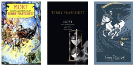
My own copy of Mort (on the left) looks very much like a fantasy novel. Though less colourful than some of Pratchett’s other books, it’s kinetic. Its characters are caricatures with exaggerated features, keeping company with the archetypes of the high fantasy genre. Think swinging weaponry, mountaintop castles and the perhaps inevitable barely-contained boobs of a tag-along maiden. Reading the book, it becomes apparent that this display is as much satire as it is serious. But it’s highly at odds with the recent re-release of the Discworld books as striking, minimal, black editions. This matches the book’s more sober aspect and fits its musings over death and the passage of time. Special editions of some of the Death-themed books have also been released that have a wonderful tactile quality to them. Regretably, not something that can be transferred to an ebook.
Less Is More: Minimalism
This example displays how a book cover can emphasise different elements of a story and appeal to different demographics. It also shows just how dissimilar covers for the same book can be. I really like the dark, minimal covers of Pratchett’s books. Might this be an aesthetic I could take influence from in my own cover design?
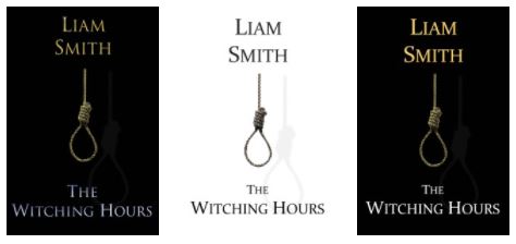
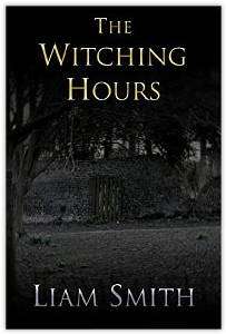
With my first attempts at a cover for The Witching Hours, I used a simple image centralised on a black background. I used a similar colour palette to the Discworld covers as I thought the monochrome and gold lent the cover a pleasing monumentality. I also experimented with trying a white background, which I liked. It distanced my cover both from its main influence and from the usual dark palette of horror stories. There was one problem though – the work was not entirely my own, the image being royalty-free stock. I taught myself how to tie a hangman’s noose but couldn’t get such a clean effect using a photograph. I decided to experiment with another style of cover.
Crime pays
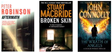
Police procedural and detective novels form a good chunk of my preferred reading material. When done well, a good mystery thriller can be gripping, surprising and emotional. There’s a certain aesthetic I associate with their book covers as well – they’re often sharp and modern, with an image that displays the same bleak world as the story, but without explicitly depicting the gory murder than will catalyse the events of the plot. Stuart MacBride and Peter Robinson have written some of my favourite novels in the genre, and their covers fit into this category. John Connolly, who flavours his excellent thrillers with a streak of the horror genre, has a slightly more dynamic look to his books that, in parallel with MacBride and Robinson’s covers, does not explicitly depict the more supernatural aspect of the book, but does inhabit its world.
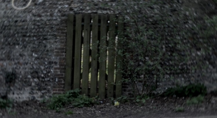
I decided to use a photograph for my next attempt at a book cover, and slung my home-made noose over a tree in a local park, receiving some curious and perhaps worried looks from a few dog-walkers as I did so. Like MacBride and Robinson’s covers, I aimed to create an asymmetrical image that, while not being explicit, hinted at some of the book’s content.
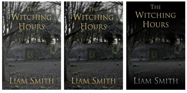
Less Is More: Editing
My main attempt at photo-editing was to add a slight circular blur to the edges of the image. Less is more, and subtle effect draws attention to the centre of the image, blurring beneath the clear text. Feedback from followers on Twitter indicated the image should be darker, but I wasn’t wholly satisfied with this – I thought the image just seemed muddier. After thinking more about the aesthetic I was aiming for, I realised that simply lowering the brightness of the images wasn’t the best way to darken the overall effect. I added dark patches to the top and bottom of the image, over which (witch?) the text could sit in contrast. The effect is darker but not so murky as simply adjusting colour levels.
Ultimately, I’ve used the photograph as my final book cover. I like that I arranged and edited the image myself – it seems to fit the more ‘DIY’ aesthetic of self-publishing, and it pays a little tribute to the books I enjoy reading. There’s a hint of my attempts at a minimal design in there too – the image may have changed, but the colour palette is the same. This exercise has also taught me to pay more attention to book covers – each is carefully considered choice, designed or picked for its propriety or effect.
Still, the difficulty I had in designing the book cover was nothing compared to the unexpected trouble I had writing the book’s blurb…