I have a philosophy about poetry. This philosophy informs a lot of my views about writing and the arts and, despite its simplicity, it took me a while to figure out exactly what it was that made me like some genres of art and not others. In turn, it’s helped me deconstruct those genre prejudices and figure out what it is that I truly like and dislike, irrespective of labels. Being an architecture graduate, I’ll use an example below of poetry in architecture, but other art forms can share this philosophy too. It goes something a little like this:
Art has to look good on the surface before it can have a deeper meaning.
As I said: simple. It even has a flaw, like so many great philosophies – what looks good on the surface is entirely subjective anyway. And likewise, what people take from art, whatever metaphor they unearth from behind its exterior, is also a personal interpretation. That’s what poetry is all about. But let me explain with an example: in this case, using architecture.
Chiswick House Cafe
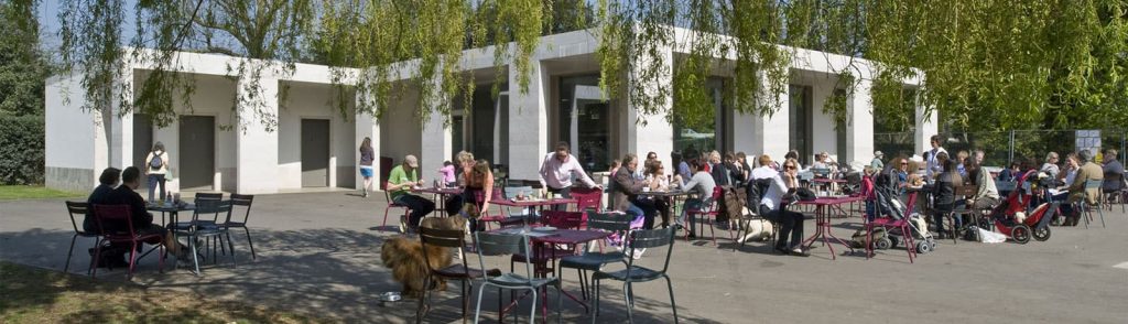
This is Chiswick House Cafe in London, by Caruso St John Architects. It is situated in the grounds of Chiswick House and was named London Building of the year in 2011 by RIBA, the Royal Institute of British Architects, and it is a work of art (a quick Google Image search might furnish you with a fuller impression of the building than the one image on RIBA’s site). It has been designed as a functioning building and also as an architectural statement: its clean, white form is a reinterpretation of the Palladian style of Chiswick House itself, emphasising straight geometry and simplification of form.
There’s no unnecessary ornament on the building – it achieves its effect through subtlety. Understatement. Meaning.
And I don’t like it.
The building does have poetry in architecture; it smartly brings classical principles into the 21st century. And with its stripped down exterior, you couldn’t accuse it of ‘bolting-on’ architectural features in order to provide decoration. But to me it seems soulless. The deeper meaning is there, but it is all that’s there. The building’s surface been synthesised into a charmless box that must be explained to be appreciated. At face value, it’s a simple, blocky, basic shape. A house made out of Jenga blocks.
Refectory at Southwark Cathedral
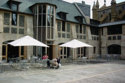
The Refectory at Southwark Cathedral, designed by Richard Griffiths Architects, is another contemporary cafe serving a historic site. But I’ve got less beef with the Southwark’s Refectory than with Chiswick’s Cafe, and that’s because it looks nicer. Yes, aesthetics are subjective, and I’m sure some will prefer the cafe. But I think the Refectory is more pleasing to the eye for simple, obvious reasons.
Its use of warmer colours makes it seem more inviting. It has a slanted roof, like a stereotypical house, so its form is more familiar and so pleasing. Its dormer windows break through the roof to form niches just waiting to be explored, and even if the swatches of stone arranged beneath them are a little clinical in shape and arrangement – a little haute cuisine, perhaps – they at least increase the overall tactility of the composition. The central turret too – there are less brazen ways of hearkening back to the gothic style of Southwark Cathedral than by splitting the building with a central tower, but why the hell not? It’s that sense of personality, of romanticism even, that makes the Refectory more pleasing (to me, at least) than the Cafe.
There’s poetry and meaning there too, mind. The ranks of buttresses link it to Southwark Cathedral just as the Cafe’s columns link to Chiswick House’s classical portico. The materials, stone and block, mirror those used for the cathedral. Even those dormers gaze towards the finials of the church, providing something of an effect in the same prickly vein.
Poetry and Pretentiousness
Even discounting that poetry though, that deeper meaning, the Refectory would be a better building. When I look at Chiswick House Cafe, I feel it’s pretentious – that the features of the classical style have been taken, sanded down and re-assembled Lego-brick-style to conform with other stripped down modern builds. There’s no sense of the romantic or the playful about it; it looks like it was drawn with a ruler, propelling pencil and a calculator.
If every building in the world did this – prioritised high-brow connotations over a shallower sense of expression – we could end up in a world of sheer white boxes and dispassionate glass walls, understood and appreciated only be the people who designed them.
Poetry in Architecture
Let’s take a more tempered approach to art and design – have some fun with it; inject some impulse and indulgence that anyone can see. Southwark Cathedral Refectory manages to pay homage to its parent by having fun with its details and forms, recombining them in a mode that, while contemporary, retains that nostalgic sense and that sense of personality.
Humans are social animals – we like people, we can’t help it, and we prefer to see a human achievement over a clinical production. The Refectory is great to look at – idiosyncratic and capricious, balanced and respectful – and, if we choose to examine it more closely, we find the poetry it’s been laced with too. Chiswick Cafe takes a family heirloom and locks it in a secure glass case with an information plaque; Southwark Refectory wears it and shows it off round town. I know which I’d rather see.