I’m on the verge of releasing my novella to its first reader for feedback. I’ve just finished the final proofread, and I’m satisfied that it’s free from any narrative inconsistencies and, as far as I can tell, and glaring grammatical errors. There are few places I feel the story drags or derails slightly, but I’ll wait to see if my first wave of readers pick up on these; it’s hard to judge the pacing of a book when you’ve seen ‘behind the scenes’, as it were. There’s one part of the story that has just kept changing though, and that’s the title. How do you title a book?
I’m a great believer in a good title. I hate to see an artist call a piece of work ‘Untitled’. Maybe the first person to do it deserves credit for thinking outside the box, but in most cases it just seems lazy to me. A shortcut to profundity. But a great title can deeply enrich a work. It casts its shadow over the entire piece, and can either complement or contrast it. This goes for all forms of art: music, paintings, films… and of course books.
Small beginnings
My novella actually began as a vignette entitled One Night in England. Although conceived as a quick homage to Ben Wheatley’s idiosyncratic horror film A Field in England, I think it’s too close to its inspiration. They have the same rhythm, the same sense of anonymity, the same patriotic label. Mine would have to change.
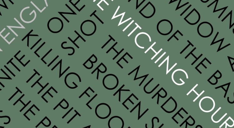
I think rhythm is an important feature of how to title a book – and lack of rhythm can be effective too. There can be something clean and minimal about a one- or two-word title. Look at Lee Child’s books, which mimic the efficient and stripped-down character of Jack Reacher: Killing Floor. One Shot. 61 Hours. Stuart MacBride has the knack too: Cold Granite. Broken Skin. Punchy titles that don’t give too much away, but that promise lean adult stories. But longer titles have their charms too. The Hound of the Baskervilles by Arthur Conan Doyle is superb, possessing real gallop, and the Harry Potter series by J K Rowling employs longer, multisyllabic words in its titles to good effect. Philosopher. Prisoner. Deathly Hallows.
Genre conventions
I read a lot, but I have my favourite genres and my favourite authors – a few are name checked above. Out of all genres of fiction, the ones I read the most tend to be crime and horror. Crime novels tend to favour the snappy titles. MacBride’s are a good example, but Linwood Barclay has a few too: Fear the Worst. Never Look Away. The Accident. Mark Billingham: Sleepyhead. Scaredy Cat. Lazybones. The list goes on.
I enjoy classic horror too though – H. P. Lovecraft titles can be sprawling and evocative, as in the case of At the Mountains of Madness, The Dreams in the Witch House, The Shadow Over Innsmouth. Edgar Allan Poe favours a good gothic title: The Masque of Red Death, The Pit and the Pendulum, The Murders in the Rue Morgue. There’s a real sense of fervour in Poe’s titles: the examples above use assonance and alliteration to create something that really rolls off the tongue beautifully.
One of my favourite bands, Cradle of Filth, take Poe’s approach to titling their work and have produced some songs with gorgeously lavish titles: Thirteen Autumns and a Widow, Creatures that Kissed in Cold Mirrors, To Eve the Art of Witchcraft. Such hyperbolic phrases could be seen as a shopping list of buzz-words, but I think the seductive rhythms of the titles evoke images of over-decorated yet artistic architecture and dark houses full of interesting bric-a-brac. They match the music of course – decadent heavy metal, moonlit by ghostly choirs and keyboards.
Contemporary and classic
My novella had a working title, once I realised that One Night In England wouldn’t cut it: The Curse of the Milbury Witch. I think the former fits alongside the modern, snappy mode of titling stories. With the exception of the proper noun, the words are monosyllabic – simple words you would use in primary school.
The Curse… is a more lurid affair – it puts its cards on the table: this is a horror story about a witch. It’s reminiscent of Hammer Horror (shades of The Curse of the Werewolf, The Shadow of the Cat, perhaps) an aesthetic now seen as retro. It appeals to me for both these reasons; I like it when things are informed by the past and I like things to deliver what they promise. The presence of a proper noun in the title is an interesting point too, and a double-edged sword: it lends the tale a more personal slant, but might be alienating for the same reason (using Milbury as a setting is something of an artistic stroke, incidentally. Milbury is a fictional version of the town of Avebury and the setting for Children of the Stones – possibly the scariest children’s series ever).
Conversely, I feel that a few recent film releases have been too vague in their titling – the similarly monikered Thor: The Dark World and Star Trek: Into Darkness are particular bugbears of mine – favouring generic subtitles barely more effective than sticking a 2 at the end.
How to title a book
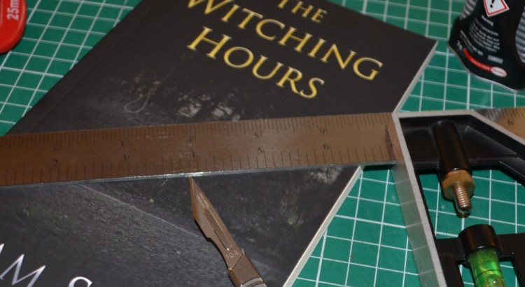
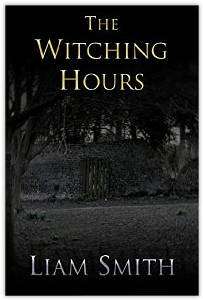
I decided on a title, in the end. The Witching Hours. It appeals to me in both the modern and the traditional senses – it’s short and fairly snappy, but it gets that oh-so-important ‘witch’ in there. It will deliver what it promises. It’s a proper idiom too – the witching hour is midnight – and this gives it a bit of familiarity, which we are naturally drawn to. My story doesn’t actually take place at midnight: more the early hours, the hour of the wolf. Hence the pluralisation. I think it fits the tone of the story too, which mixes two time periods and references both modern and classic horror tropes.
The cake is iced. Time to let someone taste it.

